
E-Commerce Mini
Camp E-Commerce Platform
Our long-term goal was to improve re-enrolment with our camps, with research & development conducted in many small cumulative steps across a range of issues. The key focus was our landing pages & search platform, which is used for booking children's coding camps by parents across the world.
My role was facilitating discovery alongside other product stakeholders,
then leading interaction design & testing.
Discovery & Synthesis
Initial User Research
I began with field interviews across two dozen customers to get a broad idea of the challenges currently faced, and figuring out what their key Jobs-To-Be-Done were.
Then, I set up remote user testing sessions to establish a baseline understanding of how the interface was performing.
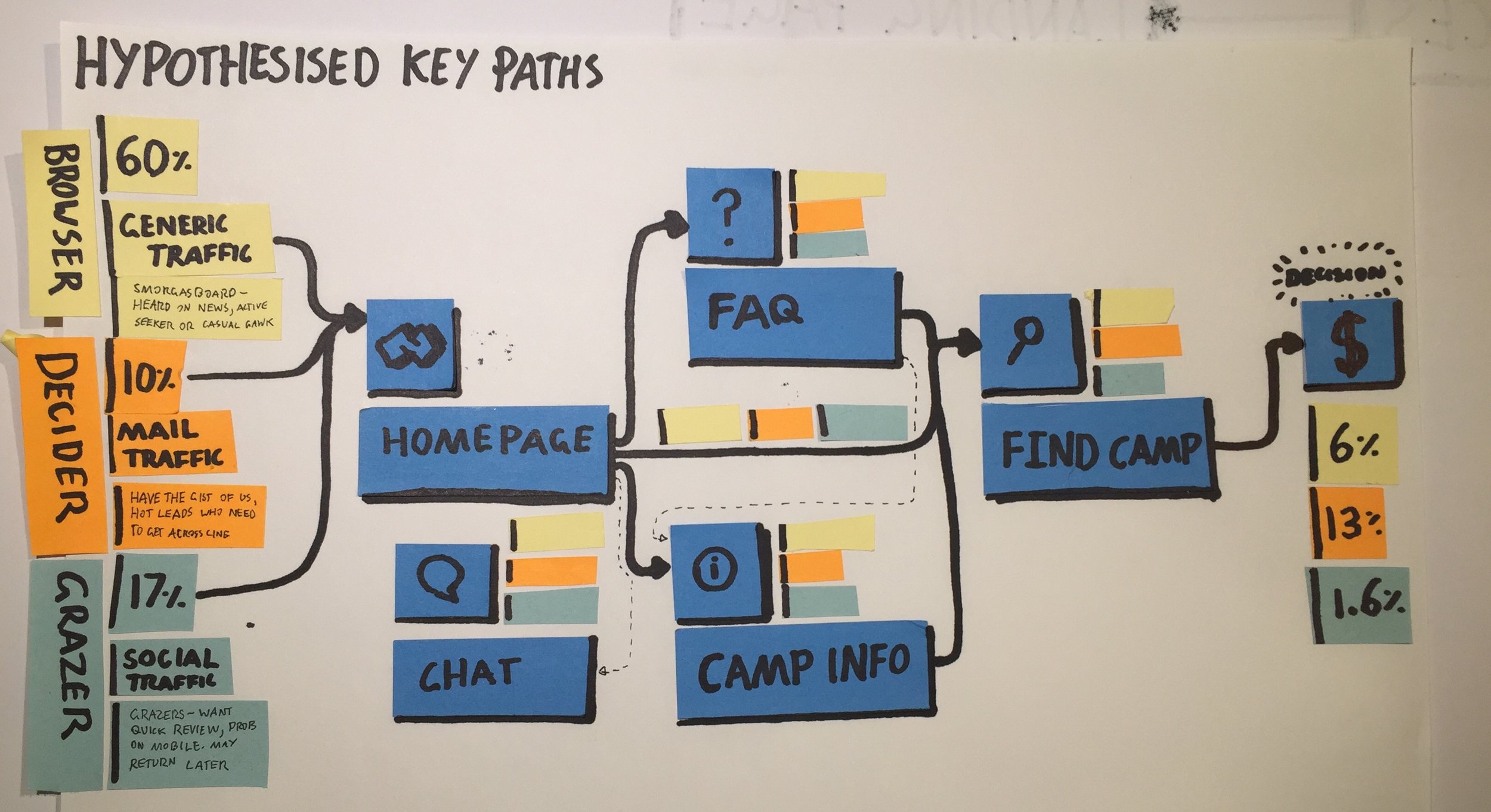
Conversion funnel insights
The next step was using data from Google Analytics, Heap & our own sales platform to build insights into user behaviour trends, helping prioritise the problems we had begun to identify.
Research Synthesis
I gathered insights from my own research, existing surveys and our complaints database to build a series of user journeys and personas we would refer to and update as the platform evolved.

Affinity mapping from our first research round. I posted my research in a high traffic spot and encouraged others to add customer insights as they observed them.
My paper model for the behaviour flow around the site. We had big questions around how much information parents needed before they made a purchase!

Early versions of our personas. These were mapped against pain points along the customer journey most specific to each persona's needs.

Over time, we gathered enough survey and behavioural data that we workshopped a prioritisation map of issues that we had identified earlier.
Design & Testing
Initial design concepts
I used sketches, wireframes and user flow storyboards to communicate and review designs with product stakeholders. You can click here for an example!
This was complemented with hallway testing to validate low fidelity designs, occasionally using guerrilla testing with target users as well. UsabilityHub used sparingly to settle fuzzier questions on layout.
High fidelity design
Working with our visual designer, I began to further detail & validate the designs with high fidelity prototypes, both for usability testing and working with stakeholders on business challenges or technical aspects of targeting/ micro interactions before developer handover.
Testing
I worked with our digital marketing team to set up, monitor and review A/B testing alongside marketing stakeholders, enabling us to review and iterate features as they deployed. This acted both as a safety barrier to ensure new ideas did not damage conversion rates, and fine tune our designs after deployment - for example, finding that the mobile version of the new camp site needed changes to deliver the same improvement the desktop redesign had offered.

Early workshops on our landing page. I learned that as more stakeholders were involved in a design, the greater the need for low-fidelity paper craft!

I preceded each round of development with a series of detailed paper prototypes and user flows we could use internally to weigh ideas against each other.
My mock up in framer for a potential "calendar" style search. Early user testing of the concept with parents showed plenty of user delight, but it's sheer complexity meant we opted for something simpler in the near term.
Impact
Deployed features
The design project delivered numerous features & small changes to company's e-commerce website. This included a complete redesign of product search process & the creation of mobile app for parents to manage camp experiences.
Aligned stakeholders
A key achievement was aligning developers, design team and executive on customer needs and potential opportunities, as part of an ongoing conversation within the company about how to best serve our customers.
Set up processes
I partnered with CTO & visual designer to set up audit & handover processes to allow easy flow of work between design team & development team. This included a mixture of checklists, tool adoption (e.g. getting the dev team on Zeplin) and establishment of team culture around handover.